Design12 min read
Dusty Blue Wedding Invitations: 9 Blues and Something Blue
Nine wedding blues from dusty to midnight, what each pairs with and when, where "something blue" comes from, and how to make the invitation itself your something blue.
By The Veiloria AtelierPublished Updated
Contents
- What are dusty blue wedding invitations?
- 9 wedding blues, side by side
- What colors go with dusty blue?
- Something old, something new, something borrowed, something blue: where it comes from
- 7 ways to make the invitation your something blue
- Ruban and six more blue designs
- Wording with a touch of blue
- A dusty blue Save the Date
- How blue reads on a phone: contrast and legibility
- Sources
- Frequently asked questions
Dusty blue wedding invitations look their best when the blue lives in the art (a ribbon, forget-me-nots, a seal, an envelope lining) and the words are set in navy or ink, because a soft grey-blue is too pale to read as text. Choose the blue by season and hour: powder and French blue for spring and summer days, cobalt and Prussian blue for gardens and the sea, slate, navy and midnight for autumn, winter and evening.
Below: nine blues side by side, what goes with dusty blue, where the rhyme comes from, seven ways to make the invitation your something blue, seven blue designs, wording to copy, the Save the Date, and how blue reads on a phone.
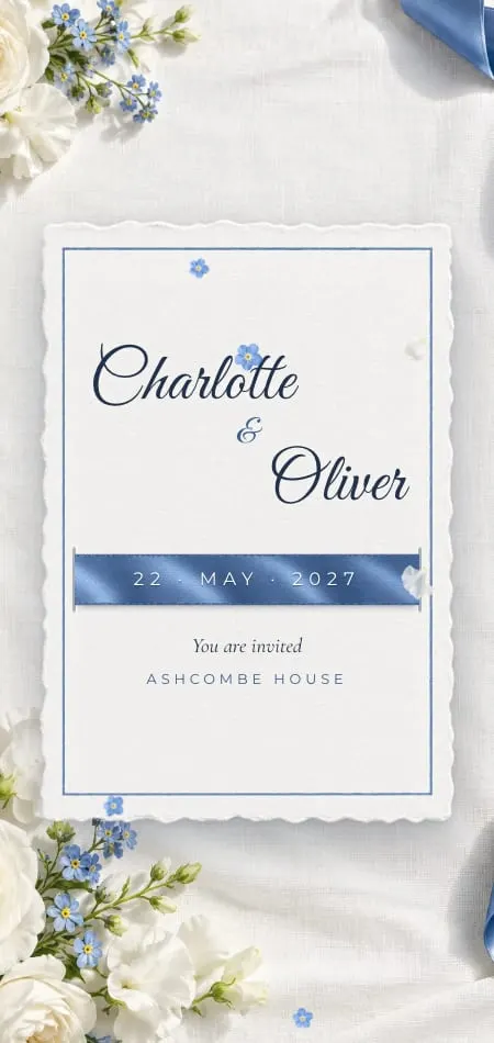
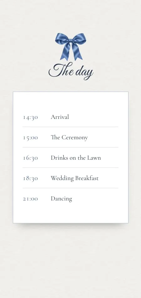
Ruban is the most literal something blue in our collection: a white cotton envelope tied with a wide French-blue silk ribbon. Guests pull the tail, the bow comes undone and slides away, the flap opens, and the card rises until your names fill the screen. Inside, every section is fresh white paper scattered with forget-me-nots.
What are dusty blue wedding invitations?
Dusty blue wedding invitations use a soft, greyed mid-blue (around #8BA3B8) as their main color, usually beside white or ivory, with sage, blush or a touch of gold. "Dusty" means the blue has been softened with grey, so it looks calm rather than bright.
Couples often compare it with its neighbors: it is greyer than baby or powder blue, lighter than slate and far paler than navy. On an invitation, the paler and greyer the blue, the less it can carry words.
9 wedding blues, side by side
Pale blues read as fresh and daytime, mid blues as classic, deep blues as formal and evening. Each row gives a typical shade, its pairings, its seasons and a design where you can watch it move.
| Blue | Typical shade | Reads as | Pairs with | Season | See it in |
|---|---|---|---|---|---|
| Dusty blue | #8BA3B8 | Soft, romantic, relaxed | Sage, blush, ivory, gold, terracotta | Spring to autumn | Cathédrale, its hidden bleu voile |
| French blue | #5B7FAE | Fresh, classic | White, ivory, silver, butter yellow | Spring, summer | Ruban, the silk ribbon |
| Powder or baby blue | #A9BFD9 | Light, airy, sweet | White, silver, blush, lilac | Spring | Ruban's palette, as a wash |
| Cornflower and forget-me-not | #6495ED | Country, sentimental | White, yellow, red, meadow green | Early summer | Ruban's forget-me-nots, Solstice |
| Cobalt | #0047AB | Delicate, Mediterranean | White, worn gold, leaf green | Spring, summer | Porcelaine |
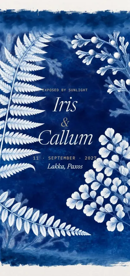
| Prussian blue | #003153 | Calm, artistic, coastal | Paper white, sand, rust | Summer by the sea | Cyanotype |
| Slate blue | #5B6E7E | Understated, modern | Grey, burgundy, copper, eucalyptus | Autumn, winter | Cathédrale's deepest shade |
| Navy | #1F2A44 | Classic, formal, nautical | White, gold, blush, burnt orange | All year, evening | Carte Postale, Carré |
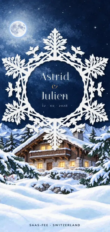
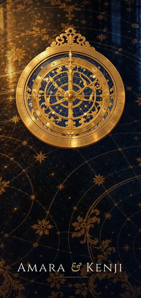
| Midnight | #0E1530 | Nocturnal, black tie | Gold, brass, silver, candlelight | Winter, evening | Céleste, Givre |
How to read it:
- Dusty and powder blue are for the art, not the words. Both fall below the contrast guests need to read a time or an address.
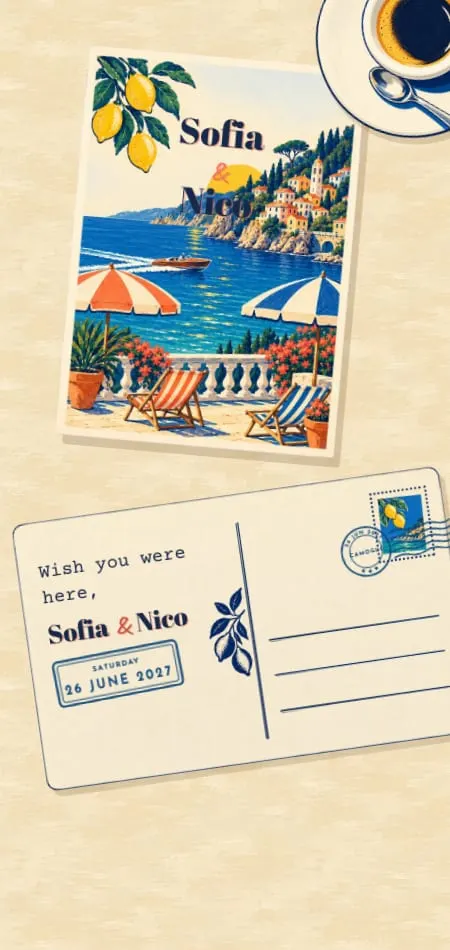
- Navy does the work. Carte Postale paints the Riviera in poster blues and coral, then keeps navy for all the reading.
- Two blues beat one. Charlotte and Oliver, our demo couple for Ruban, use French blue, powder blue and navy ink on white.
- Midnight is a background. On a dark invitation the words turn ivory or gold, as in Céleste.
What colors go with dusty blue?
Dusty blue goes with sage green, blush, ivory, gold, burgundy, terracotta, burnt orange and navy, and each pairing moves it to a different season. These are the pairings Google's autocomplete offers after "dusty blue and" (checked 28 October 2026, US English); autocomplete shows that a phrase is searched, not how often.
| Dusty blue and… | The mood | Best season | Set the words in |
|---|---|---|---|
| Sage green | A garden, eucalyptus, linen | Spring, summer | Navy or deep green |
| Blush | Romantic, soft | Spring | Navy or charcoal |
| Ivory and gold | Formal, classic | All year | Navy, gold for the monogram |
| Burgundy | Rich and warm | Autumn, winter | Burgundy or navy |
| Terracotta or burnt orange | Sun-warmed, relaxed | Late summer, autumn | Navy or espresso |
| Silver and white | Frosty, crisp | Winter | Navy |
So, is dusty blue a fall color? With burgundy or terracotta, yes; with silver and white it turns wintry. Our guide to seasonal wedding invitations goes month by month, and the wedding invitation colors hub sets blue beside six other palettes.
Something old, something new, something borrowed, something blue: where it comes from
"Something blue" comes from a nineteenth-century English wedding custom, later a rhyme, in which blue stands for purity and fidelity. The custom came first: in 1866 the folklorist William Henderson recorded, for the north of England and the Borders, that a bride should wear something borrowed. In 1871 a story in St James' Magazine has a bride-to-be say she must wear "something new, something borrowed, something blue"; an 1876 newspaper report of a wedding lists all four; the silver sixpence is a late Victorian addition.
Something old, something new,
Something borrowed, something blue,
And a silver sixpence in her shoe.
Traditional English wedding rhyme, nineteenth century
It is often called the Lancashire rhyme, but The Phrase Finder finds today's wording in a Pennsylvania newspaper, the Lancaster Intelligencer, in 1873, and suggests the two Lancasters may have been muddled. An 1898 folklore collection explained something old and something blue as "devices to baffle the Evil Eye". Many wedding sites also trace blue's faithfulness to the "ribband of blue" of Numbers 15:38 (King James Version); we found no source linking that verse to the rhyme.
| The rhyme | The traditional reading | In the invitation |
|---|---|---|
| Something old | Protection for the baby to come | A grandparent's wording, a family crest, your parents' wedding in your story |
| Something new | Optimism for the future | Your new monogram, your names side by side |
| Something borrowed | Good luck from a happily married couple | A line from a poem, or from your parents' own invitation |
| Something blue | Purity and fidelity | A ribbon, forget-me-nots, a blue seal, navy ink, a blue lining |
| A sixpence in her shoe | Prosperity, or a ward against jealous suitors | A coin in the photographs, or nothing at all |
The custom is still widely kept in the UK and the US, and it has travelled: we found its Spanish, French, German, Italian, Dutch and Portuguese translations in Google's autocomplete. Elsewhere, blue carries no wedding meaning at all. Take the rhyme as a game, not a rule.
7 ways to make the invitation your something blue
In the rhyme, the blue is a small, hidden detail, so on an invitation it works best as one gesture, not a theme. Pick one or two:
- A ribbon to untie. On paper, silk round the suite. On a screen, the ribbon is the opening: in Ruban, guests pull its tail and the bow comes undone.
- Forget-me-nots. The name is the message, in many languages: ne m'oubliez pas, Vergissmeinnicht, nontiscordardimé, nomeolvides. Our guide to floral wedding invitations covers other flowers' meanings.
- A blue seal. Wax in French blue or navy instead of red or gold. Love a sealed envelope but want it blue? That is what the Premium plan is for: the design redrawn in your colors.
- Blue ink, the dark kind. Navy and blue-black read beautifully; dusty blue ink does not.
- A blue lining. Ruban's envelope liner is painted with forget-me-nots, sweet peas and trailing ribbons, like blue-and-white china.
- A blue-and-white plate for the venue. Ruban paints the venue on a porcelain plate in cobalt; Porcelaine builds the whole invitation from tiles and china.
- A blue reply. In Ruban, when a guest replies, a bow ties itself on the card and forget-me-nots fly up from it.
On paper, every ribbon and seal is added by hand to every envelope. On a screen, your designer draws the ribbon once, and every guest unties their own.
Ruban and six more blue designs
Seven designs in our collection are built on blue, from French blue in daylight to midnight under the stars.
| Design | The blue | The opening | Season and setting |
|---|---|---|---|
| Ruban | French blue and white, forget-me-nots | A silk ribbon guests untie | Spring and summer, a country church and a garden |
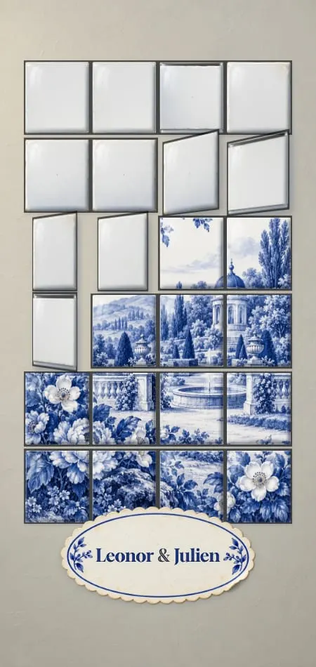
| Porcelaine | Cobalt and white, a worn-gold rim | Blank tiles turn into a painted garden | Spring, gardens and palaces |
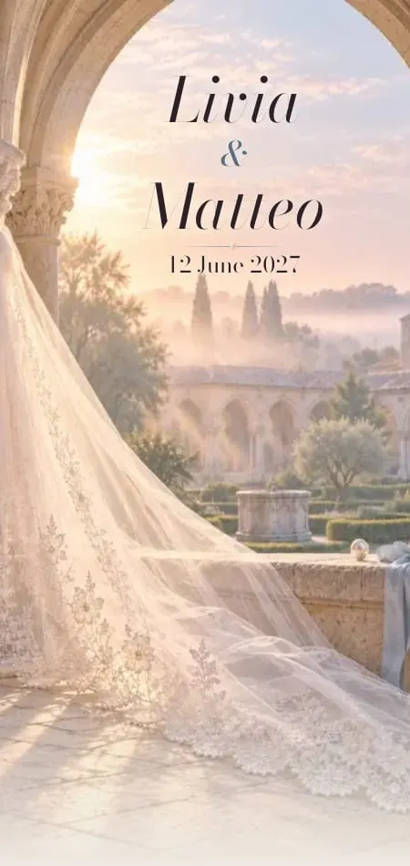
| Cathédrale | Pearl, with a hidden bleu voile | A veil lifted off a cloister at dawn | Morning ceremonies |
| Carte Postale | Riviera blue and coral, navy for every word | A postcard turned over and stamped | Summer by the sea |
| Cyanotype | Prussian blue and paper white | A sun print washed into deep blue | Summer, islands and coasts |
| Givre | Night blue and candlelight | A paper snowflake guests cut open | Winter in the mountains |
| Céleste | Midnight and brass | The rings of an astrolabe | Evenings under the stars |
Love a design that isn't blue? On Premium ($599 once, or the equivalent in your currency) your designer redraws it in your colors; Essential ($199) keeps a design's colors as they are. For a dusty blue rose garden or lace gown, start from our romantic wedding invitations and lace wedding invitations.
Wording with a touch of blue
Blue belongs in a few words too: the dress code, the story and the reply. These lines are the atelier's own; copy and adapt them.
Opening (our Ruban demo): With love and joy, Charlotte and Oliver invite you to share the day they tie the knot.
Dress code: Formal, with a touch of blue if you like: a tie, a ribbon, a flower. White is kept for the bride.
Your colors, without a rule: Our colors are dusty blue and ivory. If you'd like to join in, a little blue is welcome, never required.
The rhyme, in your story: Something old: Grandmother's lace. Something new: our names, side by side. Something borrowed: the words our parents used in 1994. Something blue: this ribbon. You have just untied it.
The reply: Kindly reply by 1 April, tell us the song that will get you dancing, and wear something blue if you'd like to be part of the rhyme.
For hosts and formal registers, see our wedding invitation wording guide; for "garden formal" and "black tie", the dress code wording guide.
A dusty blue Save the Date
Each of our designs has a matching Save the Date that plays the same opening, then ends on one keepsake with your names, the date, the place, "Formal invitation to follow" and an add-to-calendar button. Ruban's opens with the same French-blue bow.
Send it 6–12 months before the wedding, or 9–12 months ahead if guests will travel; see our guides to the digital save the date and destination wedding invitations. It costs $79 on its own or with Essential, and is included with Premium. A line to copy:
Something blue is on its way. Save the date: 22 May 2027, the Cotswolds. Formal invitation to follow.
How blue reads on a phone: contrast and legibility
On a screen, the test of a blue is whether guests can read a time and an address on it in sunlight. WCAG 2.2, the W3C's accessibility standard, asks for at least 4.5:1 contrast for normal text and 3:1 for large text (18 point, or 14 point bold). We measured this post's blues with the WCAG formula:
| Text color | On | Contrast | Use it for |
|---|---|---|---|
| Cobalt #0F2459 (Porcelaine) | Porcelain white #F7F8F6 | 13.9:1 | All text |
| Navy #1F2A44 | Ivory #FAF6EE | 13.2:1 | All text |
| Prussian blue #103A6B (Cyanotype) | Paper white #F7F5EF | 10.5:1 | All text |
| Deep French blue #3E5F8C (Ruban) | White | 6.5:1 | All text |
| Slate #5B6E7E | Off-white #FBF9F6 | 5.0:1 | Text, with little to spare |
| French blue #5B7FAE | White | 4.1:1 | Large headings only |
| Cornflower #6495ED | White | 3.0:1 | Large headings, at the limit |
| Dusty blue #8BA3B8 | White | 2.6:1 | Ornament, not text |
| Powder blue #A9BFD9 | White | 1.9:1 | Backgrounds and washes |
| Ivory #E8DCC0 | Midnight #0E1530 | 13.2:1 | All text |
Three habits keep a blue invitation readable:
- Give your designer hex codes, not names. "Dusty blue" covers a dozen shades.
- Approve the proof on your own phone, at night, brightness down, and again with night or eye-comfort mode on: warm filters can push pale blues towards grey.
- No white text on dusty blue. It looks soft on a laptop and vanishes in the sun. Reverse type only on navy or midnight.
More on legibility in our guide to digital invitations for older guests, and on where blue sits among next year's looks in wedding invitation trends.
Sources
- Wikipedia, "Something old", checked 28 October 2026: the 1871 St James' Magazine story, the 1876 report, the 1898 folklore compilation, each item's meaning, the sixpence as a later addition.
- The Phrase Finder, "Something old, something new, something borrowed, something blue", checked 28 October 2026: Henderson (1866), the Lancaster Intelligencer (1873).
- Numbers 15:38, King James Version, Bible Gateway, checked 28 October 2026.
- W3C, WCAG 2.2, success criterion 1.4.3 (Contrast, Minimum), checked 28 October 2026.
- Google autocomplete, US English: "dusty blue and", "dusty blue vs", "something blue wedding", checked 28 October 2026. Contrast ratios: our own calculations with the WCAG 2.2 formula.
Frequently asked questions
What colors go with dusty blue for a wedding?
Sage green, blush, ivory, gold, burgundy, terracotta, burnt orange and navy all go with dusty blue. Sage and blush keep it in spring and summer, burgundy and terracotta move it into autumn, silver and white make it wintry. Whatever the pairing, set the words in navy or another dark shade.
What does "something blue" mean at a wedding?
"Something blue" stands for purity and fidelity. It is the fourth item of the Victorian English custom "something old, something new, something borrowed, something blue", worn by the bride for luck. Today it can be a blue garter, a ribbon, forget-me-nots in the bouquet, or a blue detail on the invitation.
Where does "something old, something new, something borrowed, something blue" come from?
It comes from nineteenth-century England. Wearing something borrowed was recorded in 1866, the first lines appear in print in 1871, a fuller version in an 1876 wedding report, and the silver sixpence was added in late Victorian times. It is often called the Lancashire rhyme, an origin that is plausible rather than proven.
Is dusty blue a fall color?
Dusty blue works in every season, and its companions decide which: blush and sage for spring and summer, burgundy or terracotta for autumn, silver and white for winter.
What is the difference between dusty blue, baby blue and navy?
Dusty blue is a mid-blue softened with grey; baby or powder blue is lighter and clearer; navy is a very dark blue, almost ink. On an invitation, navy can carry all the text, while dusty and baby blue belong in the art, the borders and the flowers.
Can the text on a wedding invitation be dusty blue?
Not for the details guests need to read. A typical dusty blue measures about 2.6:1 on white, below the 4.5:1 WCAG 2.2 asks for normal text. Use navy or a deep French blue for the words.