Inspiration11 min read
Wedding Invitation Colors: 7 Palettes and 43 Designs
Seven invitation palettes, from gold and crimson to sage, blue and ink: how to choose yours, which colors guests can read on a phone, and 43 designs sorted by color.
By The Veiloria AtelierPublished Updated
Contents
- How to choose wedding invitation colors in three steps
- Wedding invitation colors at a glance: 7 palettes, 43 designs
- Gold and champagne wedding invitations
- Burgundy, crimson and red wedding invitations
- Blush and rose wedding invitations
- Blue wedding invitations: navy, cobalt and dusty blue
- Green wedding invitations: emerald, sage and garden green
- Ivory and neutral wedding invitations
- Ink and noir wedding invitations
- What ink color is best for a wedding invitation?
- Light or dark: choosing the mood
- How to match the invitation to your wedding color palette
- Colors couples search for: sage, terracotta, olive
- Sources
- Frequently asked questions
The best wedding invitation colors are one main color taken from your wedding, one neutral (ivory, white or ink) and, at most, one metallic accent, with the words set in a shade dark or light enough to read on a phone. Light palettes suit daytime and garden weddings; dark ones suit evening and black tie.
A wedding invitation color palette is the two to four colors that do the work on your invitation: a background, a text color, a main color and sometimes a metal. Below: seven palettes, the text colors that stay legible, and all 43 of our designs by color. For what makes an invitation feel refined, see our guide to luxury digital wedding invitations.
How to choose wedding invitation colors in three steps
Start from something real at your wedding, give each color one job, and test the result on a phone.
- Take the main color from the day itself. The flowers, the bridesmaids' dresses, the venue's stone. If it isn't at the wedding, it doesn't belong on the invitation.
- Choose the neutral by the hour. Ivory, paper white or sand for daytime; ink, midnight or theatre black for evening.
- Give each color a job. Background, text, main color, accent. The decorators' 60-30-10 rule of thumb works: 60% neutral, 30% main color, 10% metal.
Wedding invitation colors at a glance: 7 palettes, 43 designs
Each of our 43 designs belongs to one or two of the seven color families, and 11 of them are dark. The table uses the same color families as the filters on our design collection.
| Palette | Reads as | Best for | Light designs | Dark designs |
|---|---|---|---|---|
| Gold and champagne | Celebratory | Evening, black tie, winter | Éventail, Vendange, Bulles, Enluminure, Jharokha, Dentelle, Billet Doux | Céleste, Minuit, Lanternes, Serenissima, Soirée |
| Crimson and red | Opulent, festive | Evening, fall, vineyards | Cachet, Éventail, Vendange, Instantané, Solstice, Jharokha | Velours |
| Blush and rose | Romantic | Spring, garden, daytime | Herbier, Carte Postale, Toile, Sucre, Conte, Hacienda, Lavande, Roseraie, Billet Doux, Ciel | Clair-Obscur, Écrin, Golestan |
| Something blue | Calm or coastal | Coast, summer, dawn, winter | Cathédrale, Carte Postale, Porcelaine, Lavande, Selva, Cyanotype, Carré, Solstice, Ruban, Ciel | Givre, Golestan |
| Garden green | Fresh, generous | Garden, spring, destination | Orangerie, Zellige, Sucre, Bulles, Selva, Carré, Roseraie, Portail | Nacre |
| Ivory and neutral | Quiet, timeless | Any season, ceremony first | Cachet, Cathédrale, Herbier, Kintsugi, Dune, Instantané, Calligraphe, Ruban, Dentelle, Portail | Nacre |
| Ink and noir | Formal, dramatic | Evening, city, New Year's Eve | Chapitre | Velours, Céleste, Givre, Clair-Obscur, Minuit, Écrin, Soirée |
Gold and champagne wedding invitations
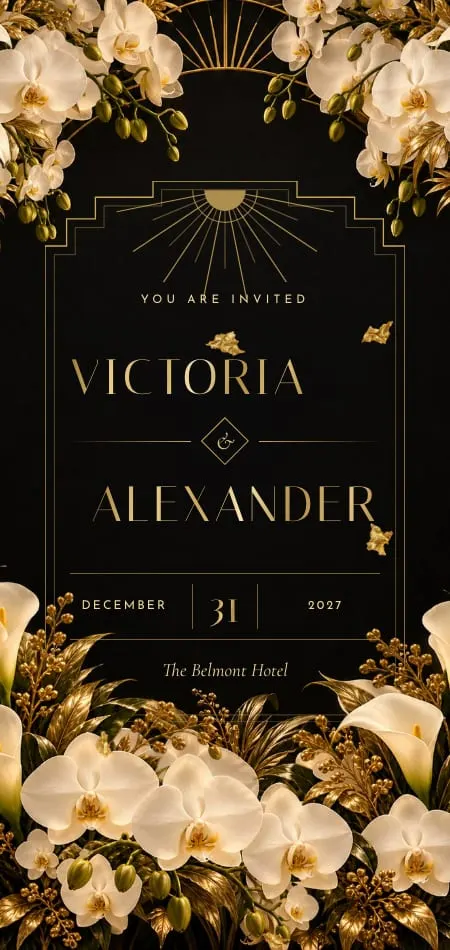
Gold reads as celebration, and it works best as the accent, not the text, on a light invitation. On ivory, a typical gold measures about 2.7:1 contrast, too faint for an address; on black it rises to about 8.4:1.
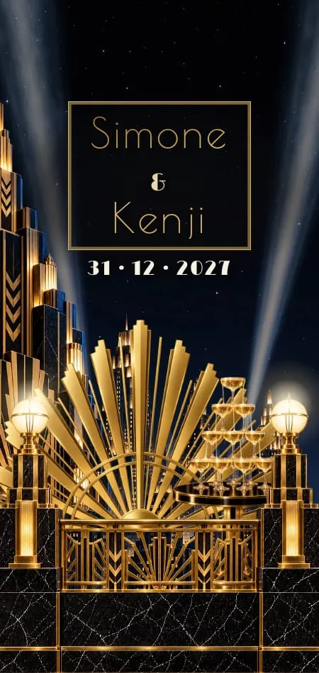
That is the case for black and gold wedding invitations: the dark ground lets gold carry whole lines of type. On a light invitation, keep gold for the monogram, borders and the date, and set the words in ink. Our guide to black and gold wedding invitations has six palettes and black-tie wording to copy; Soirée opens a black pochette in a spiral of gold foil.
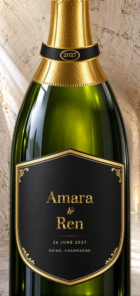
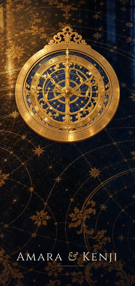
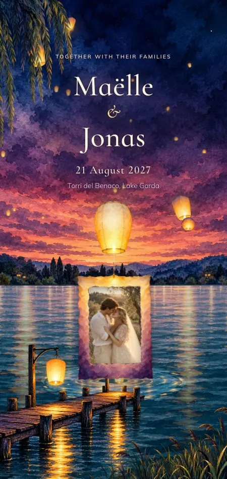
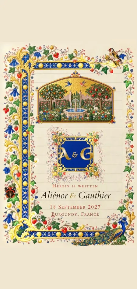
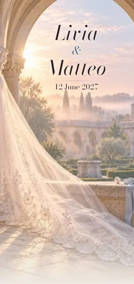
In our collection, Bulles opens a Champagne house in chalk, gold and bottle green. Céleste turns a brass astrolabe on midnight. Enluminure gilds an illuminated leaf at a touch.
Burgundy, crimson and red wedding invitations
Deep reds are the rare main color that also works as text: a burgundy measures about 10.6:1 on ivory.
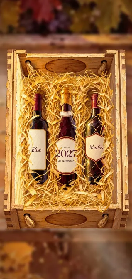
Oxblood and Bordeaux feel formal, for fall (autumn), winter and black tie; geranium and tomato red feel joyful and daytime. Google's autocomplete pairs burgundy wedding invitations with gold, green, navy and blush (checked 19 October 2026, US English): gold and green for fall, navy for a classic wedding, blush for a softer one.
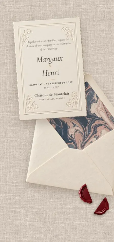
Cachet is cotton stationery with an oxblood wax seal. Velours raises a crimson curtain on your names. Vendange pairs Bordeaux with harvest gold, the burgundy-and-gold pairing in one design.

Blush and rose wedding invitations
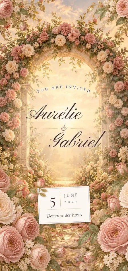
Blush is a background and an accent, never a text color: pale pink on ivory measures about 1.5:1, which guests cannot read.
Charcoal or burgundy text gives a romantic invitation its spine. Searches pair blush with both burgundy and sage green; it suits spring and daytime, and softens a dark palette as rose gold or peony.
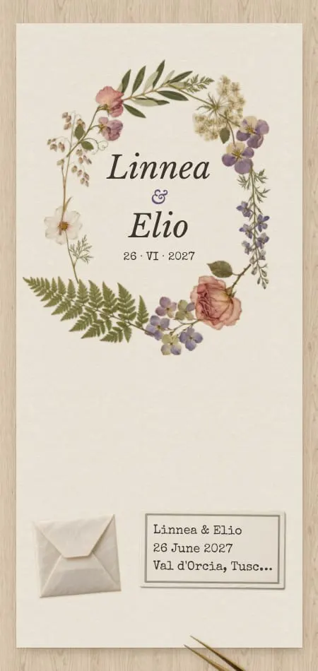
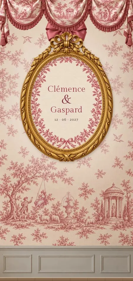
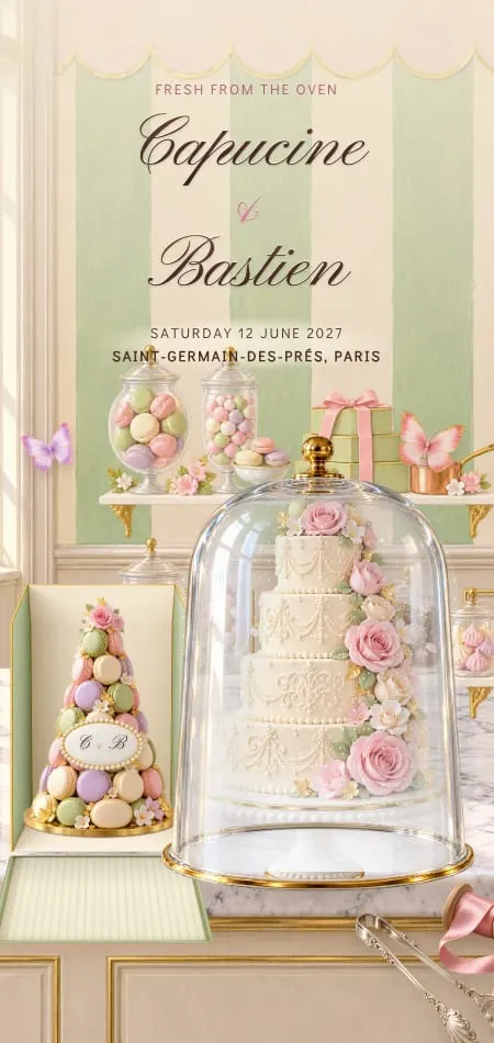
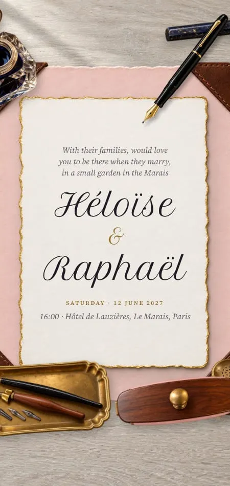
Toile prints rose toile on a folding screen in a salon. Sucre sets pistachio against rose under a misted cloche. Herbier presses flowers in faded violet and cotton. For roses, peonies and what each flower says, see our guides to romantic wedding invitations and floral wedding invitations.
Blue wedding invitations: navy, cobalt and dusty blue
Navy is the safest color on any invitation; dusty blue is lovely but belongs in the art, not the words. Navy measures about 13.2:1 on ivory; a typical dusty blue about 2.4:1.
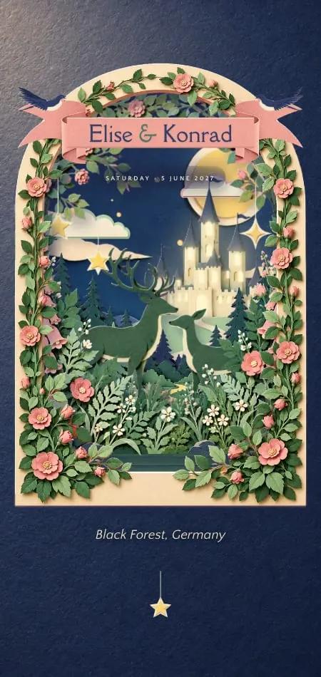
Blue spans the widest range of settings: cobalt for a painted garden, Prussian blue for the sea, night blue for an Alpine winter, pale bleu for a dawn ceremony. Searches pair navy with burnt orange, blush and gold; navy and burnt orange is a warm pairing for fall.
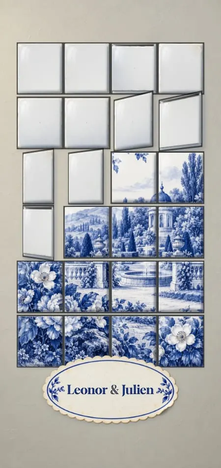
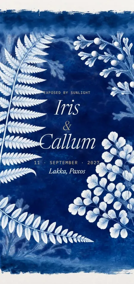
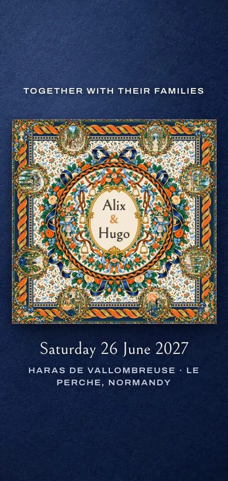
Carré unties a silk scarf in navy, orange and emerald. Cyanotype washes a sun print into Prussian blue. Porcelaine is blue-and-white porcelain with a painted garden. Ruban unties a French-blue silk bow, the bride's something blue; our guide to dusty blue wedding invitations covers nine blues and what to pair them with.
Green wedding invitations: emerald, sage and garden green
Deep greens (emerald, forest, bottle) carry text and formality; pale greens like sage carry mood. A forest green measures about 9.0:1 on ivory; a typical sage about 2.2:1.
Sage green wedding invitations
Sage green works as the main color when the words are set in something darker. Searches pair it with gold, blush pink, white and dusty blue. Avoid white text on sage (about 2.4:1); use forest green, charcoal or navy, and keep gold for the monogram. Roseraie pairs sage with old rose in a rose garden at golden hour.
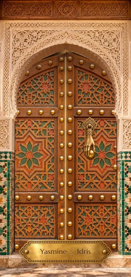
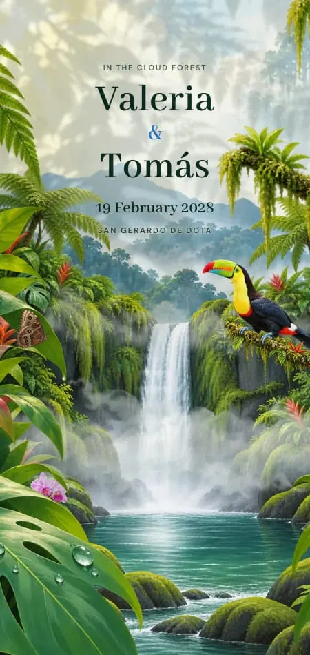
For a deep green, Zellige opens a riad door on emerald and brass. Orangerie wipes the fog from a glasshouse in citrus and iron green. Selva follows a blue morpho through a cloud forest.

Ivory and neutral wedding invitations
Ivory is the color that makes every other color look intended. Black ink on ivory measures about 16:1, the most legible pairing in this guide.
Clay, washi, sand, pearl and cotton each carry a different warmth. Pantone named PANTONE 11-4201 Cloud Dancer, "a lofty white", its Color of the Year 2026 (pantone.com). Choose a neutral alone when the venue is colorful enough already.
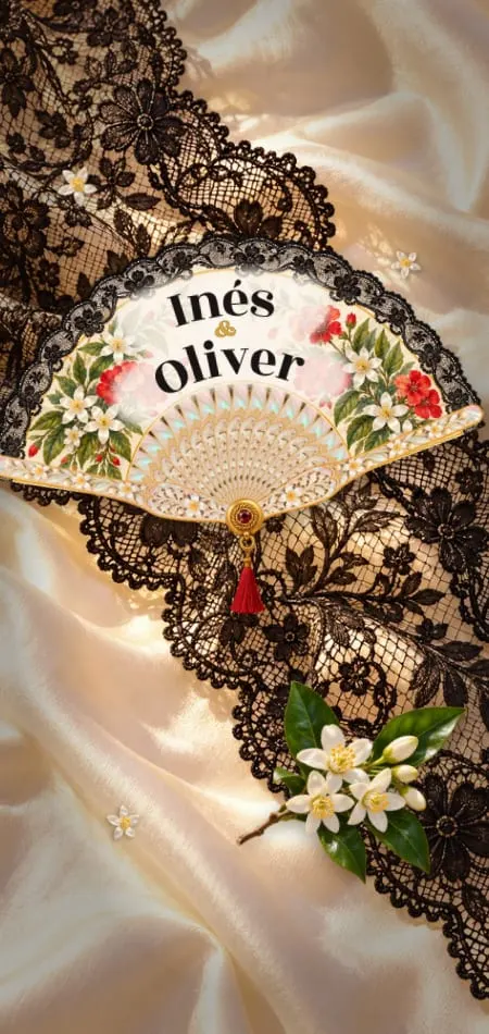
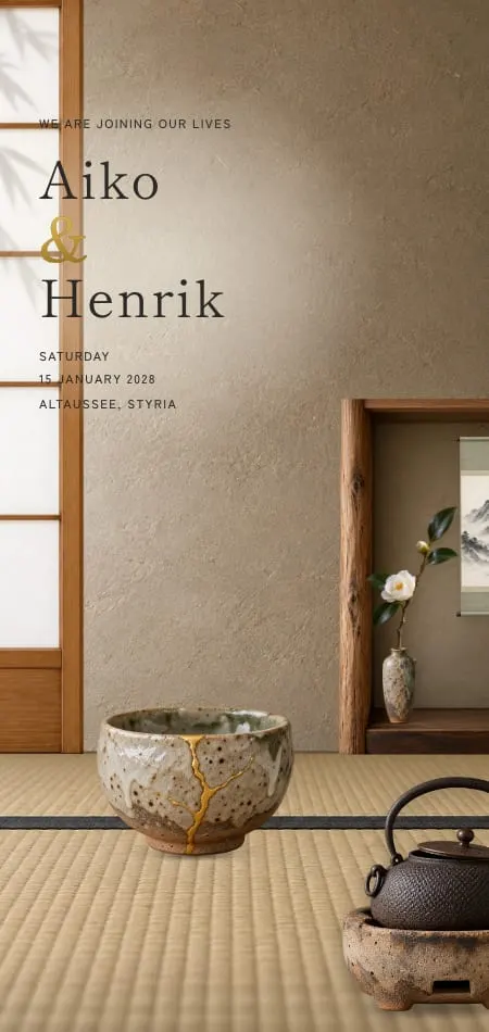
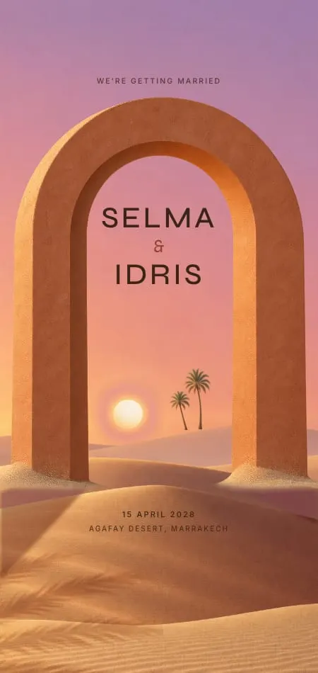
Kintsugi mends stoneware in gold on clay and washi. Dune brushes the sand from a buried tablet in terracotta and sand. Calligraphe writes your names live in iron-gall ink. Dentelle lays ivory Chantilly lace over champagne satin.
Ink and noir wedding invitations
A black or midnight invitation says "evening" before guests read a word. Ivory type on midnight measures about 15:1, so a dark invitation can be as legible as a light one.
Ink and noir suit black tie, city rooftops and New Year's Eve. Keep the text ivory, never gray, and let one metal shine.
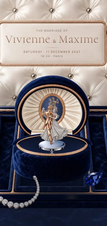
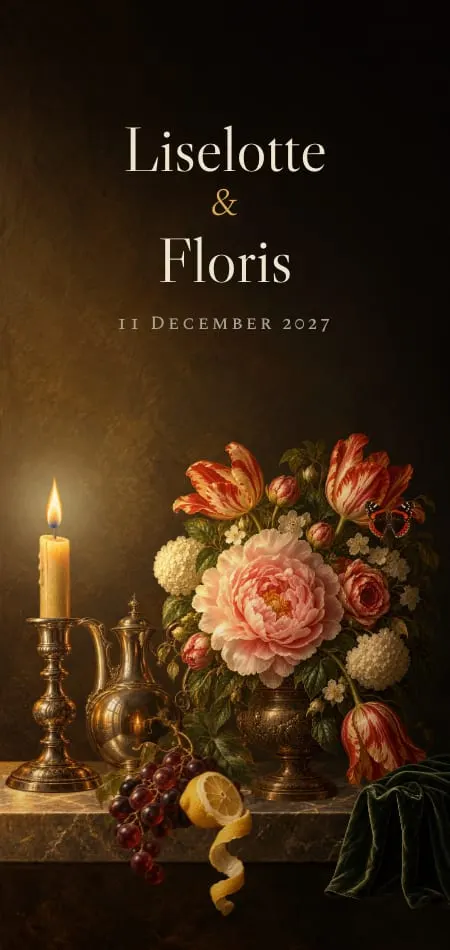
Minuit rides a gilded elevator to a midnight rooftop in black and gold. Écrin opens a ring box in midnight velvet and rose gold. Chapitre is a green morocco book, printed for your guests.

What ink color is best for a wedding invitation?
Black, navy, burgundy and forest green are the best text colors on a light invitation; ivory and gold are best on a dark one. WCAG 2.2, the W3C's accessibility standard, asks for 4.5:1 contrast for normal text and 3:1 for large text.
We measured typical shades with the WCAG formula; check your own in any contrast checker.
| Text color | On | Contrast | Use it for |
|---|---|---|---|
| Black #1A1A1A | Ivory #FAF6EE | 16.1:1 | All text |
| Navy #1F2A44 | Ivory | 13.2:1 | All text |
| Burgundy #6D1A2B | Ivory | 10.6:1 | All text |
| Forest green #2F4A3A | Ivory | 9.0:1 | All text |
| Terracotta #B5603E | Ivory | 4.1:1 | Large headings only |
| Gold #B8925A | Ivory | 2.7:1 | Ornament, not text |
| Dusty blue #8BA3B8 | Ivory | 2.4:1 | Ornament, not text |
| Sage #9CAF88 | Ivory | 2.2:1 | Ornament, not text |
| Blush #E8C4C0 | Ivory | 1.5:1 | Background only |
| Ivory #F5EFE3 | Midnight #141B2D | 15.0:1 | All text |
| Gold #C9A96E | Black #111111 | 8.4:1 | All text |
| Gold #C9A96E | Navy #1F2A44 | 6.4:1 | All text |
| White #FFFFFF | Sage #9CAF88 | 2.4:1 | Avoid |
Light or dark: choosing the mood
Match the invitation to the hour and the dress code: light for daytime, dark for evening and black tie. The invitation is guests' first hint of what to wear; our guide to dress code wording on wedding invitations covers the words.
- Daytime, garden, brunch: light, with a main color from the flowers.
- Black tie and evening: dark, or light with oxblood or ink type.
- Winter: either. Night blue feels like snow at dusk, clay and gold like a quiet morning.
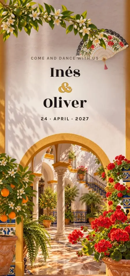
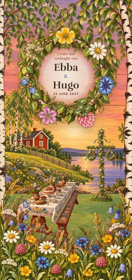
- Destination: follow the light of the place: ochre in Seville, emerald in Marrakech, marigold in Udaipur.
Season shifts the choice too; our guide to wedding invitations by season goes from spring to winter.
How to match the invitation to your wedding color palette
Give your designer exact colors, a role for each, and one thing to avoid. "Sage" means a dozen greens, so names alone are not enough.
- Photograph the real thing in daylight (fabric swatch, florist's moodboard) and add hex codes or a Pantone number if you have them.
- Assign the roles: background, text, main color, accent.
- Name one color you don't want.
- Approve the proof on your own phone, not a laptop.
Copy this palette brief:
Main color: dusty blue (#8BA3B8), for the art and borders
Neutral: ivory, for the background
Text: navy
Accent: brushed gold, monogram and date only
Avoid: silver and bright white
Mood: garden lunch, relaxed formal
On our Premium plan, your designer redraws the design in your colors, with your venue painted by hand on the cover. Essential keeps a design's colors as they are, and bespoke digital wedding invitations begin from a blank page. For starting points by theme, see our digital wedding invitation ideas.
Colors couples search for: sage, terracotta, olive
Sage green, terracotta and olive are the named colors that show up in invitation searches across languages. Autocomplete shows that a phrase is searched, not how often.
| Color | Seen in autocomplete | Paired with | Closest designs as they are |
|---|---|---|---|
| Sage green | English; French faire-part mariage vert sauge | Gold, blush pink, white, dusty blue (English); gold, rose, terracotta (French) | Roseraie (old rose and sage), Sucre (pistachio), Nacre (sea glass) |
| Terracotta | English; French; German Hochzeitseinladung terracotta; Portuguese convite casamento terracota | Boho, fall (English); sage green, gold (French); olive green (Portuguese) | Dune (terracotta and sand), Éventail (ochre) |
| Olive | English; French faire-part mariage vert olive; Portuguese convite digital casamento verde oliva | Terracotta (Portuguese) | Orangerie (iron green), Selva (jungle green) |
| Burgundy | English | Gold, green, navy, blush | Vendange, Cachet |
| Navy | English | Burnt orange, blush, gold | Carré |
Roseraie is our one sage design, set with old rose; none is olive as it stands, and the Premium redesign described above is how to have either in your own shade. For terracotta, set the words in espresso or ink: terracotta reaches about 4.1:1 on ivory, enough for a large heading, not an address.
Sources
- W3C, Web Content Accessibility Guidelines (WCAG) 2.2, success criterion 1.4.3 (Contrast, Minimum). Checked 19 October 2026.
- Pantone, Color of the Year 2026: PANTONE 11-4201 Cloud Dancer. Checked 19 October 2026.
- Google autocomplete (suggestqueries.google.com), US English: "wedding invitation colors" and sage, olive, terracotta, burgundy, navy and black and gold wedding invitations. Checked 19 October 2026.
- Google autocomplete, France, Germany and Brazil: faire-part mariage vert sauge, faire-part mariage terracotta, faire part mariage vert olive, Hochzeitseinladung terracotta, convite casamento terracota, convite digital casamento verde oliva. Checked 19 October 2026.
- Contrast ratios: our own calculations with the WCAG 2.2 relative luminance formula, on the hex values shown.
Frequently asked questions
What colors should a wedding invitation be?
A wedding invitation should use one main color from your wedding, one neutral and, at most, one metallic accent. Keep the text dark (black, navy or burgundy), or ivory on a dark invitation.
Should wedding invitations match the wedding colors?
Yes, but they should echo the palette, not repeat every shade. Pick the main wedding color and one neutral, and leave the rest of the palette to the flowers and tables.
What ink color is best for wedding invitations?
Black, navy, burgundy and forest green are the best ink colors on a light invitation, all above 9:1 contrast on ivory. On a dark invitation, ivory or gold reads best. Avoid sage, blush, dusty blue and light gold for text: they fall below the 4.5:1 contrast WCAG 2.2 sets for normal text.
Are dark wedding invitations a good idea?
Dark wedding invitations are a good idea for evening, black-tie and winter weddings. Ivory text on midnight is about as legible as black on ivory; keep the type ivory or gold, never gray.
Can I change the colors of a digital invitation design?
It depends on the plan. With Veiloria, Essential keeps a design's colors as they are, Premium has your designer redraw the design in your colors, and Bespoke begins from a blank page in whatever palette you choose.